My website is reasonably fast.
I hope that every page load feels snappy, no matter your device or location. That should not come as a surprise. After all, I’m just using plain HTML and CSS. JavaScript is avoided whenever possible.
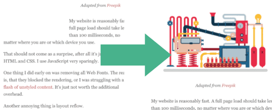
There was one thing left, which really annoyed me: layout reflow after images got loaded.
The problem is, that the image dimensions are not known when the text is ready to be displayed. As a result, the text will be pushed down on the screen as soon as an image is loaded above.
Also, while an image is loading, there is no preview, just blank space. Here’s what that looks like on a slower connection:
I could fix that, by hardcoding the image width and height, but that would be tedious and error-prone. And there would be no preview. So I was wondering, what others were doing. 🤔
Tiny image thumbnails
I vaguely remembered, that Facebook uses tiny preview thumbnails in their mobile app. They extract the quantization table from the JPEG header to render the preview. This information is stored on the client, so it doesn’t need to be downloaded every time. Unfortunately, this approach requires full control over the image encoder. It works for apps, but hardly for websites.
The search continued.
Until my colleague Tobias Baldauf introduced me to LQIP (Low-Quality Image Placeholders).
Here’s the idea:
- Load the page including inlined, low-quality image thumbnails.
- Once the page is fully loaded (e.g. when the
onloadevent is fired), lazy load full quality images.
Unfortunately, this technique requires JavaScript. Nevertheless, I liked the idea, so I started experimenting with different image sizes and formats. My goal was to create the smallest thumbnails using any standard image format.
Benchmark
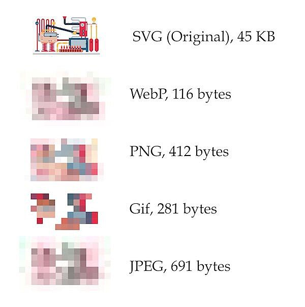
Here are 15 pixel wide thumbnails encoded in different file formats:
I used different tools to create the thumbnails. For JPEG and PNG encoding, I used svgexport.
svgexport img.svg img.png "svg{background:white;}" 15: 1%For webp, I used cwebp:
cwebp img.png -o img.webpThe gif was converted using an online tool and optimized using gifsicle:
gifsicle -O3 < img.gif > img_mini.gifComparison
WebP is the smallest, but it’s not supported by all browsers.
Gif was second, but when resizing the image and applying the blur filter, I was not happy with the result.
In the end, I settled for PNG, which provided an excellent tradeoff between size and quality. I optimized the images even further using oxipng, which supports zopfli compression. With that, I end up with thumbnails of around 300-400 bytes in size.
I integrated the thumbnail creation process into my build toolchain for the blog. The actual code to create the images is rather boring. If you really want to have a look, it’s on Github.
Avoiding JavaScript
Here is the skeleton HTML for the image previews:
<figure>
  <div class="loader">
    <object data="image.svg" type="image/svg+xml"></object>
    <img class="frozen" src="data:image/png;base64,..." />
  </div>
</figure>
The trick is to wrap both the full-size image and the preview image into a loader div, which gets a width: auto CSS attribute:
.loader {
  position: relative;
  overflow: hidden;
  width: auto;
}
I wrap the SVG into an object tag instead of using an img element. This has the benefit, that I can show a placeholder in case the SVG can’t be loaded. I position the object at the top left of the loader div.
.loader object {
  position: absolute;
}

.loader img,
.loader object {
  display: block;
  top: 0;
  left: 0;
  width: 100%;
}
Here’s the placeholder hack including some references:
/* https://stackoverflow.com/a/29111371/270334 */
/* https://stackoverflow.com/a/32928240/270334 */
object {
position: relative;
float: left;
display: block;
&:
absolute;
top: 0;
left: 0;
display: block;
width: 1000px;
height: 1000px;
content: "";
background: #efefef;
}
}The last part is the handling of the thumbnails. Like most other sites, I decided to apply a blur filter. In a way, it looks like the image is frozen, so that’s what I called the CSS selector. I also applied a scaling transformation to achieve sharp borders.
.frozen {
-webkit-filter: blur(8px);
-moz-filter: blur(8px);
-o-filter: blur(8px);
-ms-filter: blur(8px);
filter: blur(8px);
transform: scale(1.04);
animation: 0.2s ease-in 0.4s 1 forwards;
width: 100%;
}
@keyframes fade {
0% {
opacity: 1;
}
100% {
opacity: 0;
}
}I use CSS animations instead of JavaScript.
The duration of the animation is based on the 95% percentile load time of all visitors of the page. Although it’s just an approximation, this should work for most readers.
Result
- No JavaScript needed
- Works on all modern browsers
- Supports a fallback in case the main image can’t be loaded
- Tiny overhead